Branding a City

BRANDING A CITY

The project we have been given is to essentially create a travel guide or city guide to a place of our choosing. I have been looking through many different cities that I think could make a good guide and the following 7 are my favourite so I have decided to collect pictures from each of these beautiful places to get some inspiration as to which one is suited best to both my interest and my style of design.
There is also the topic of places, events, landmarks and entertainment in each city so I will be taking this into consideration whilst choosing my city.

Milan, Italy
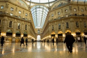
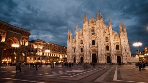
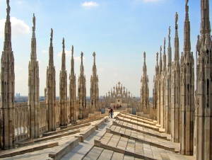
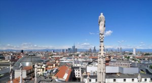
Galleria-Vittorio-Emanuele-II-in-Milan milan_cnt_17nov09_iStock_B Milan_hero Milan-Cathedral-Roof milan-skyline
Milan has always been a hotspot for historic buildings and has recently become a popular place for fashion events and high-end shopping. Amongst the designer clothes and expensive shops are attractions such as La Scala Opera, the National Museum of Science and Technology, Santa Maria della Grazie (the church that preserves da Vinci’s “Last Supper”) and the Milan Cathedral.

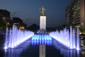
Seoul, South Korea
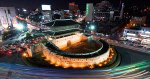
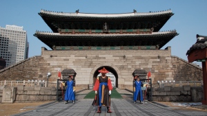
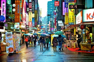
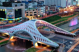
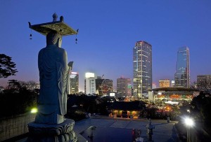
002de Korea-Seoul-Namdaemun-Sungnyemun-11 nmarket1-1412759337 Seoul-Korea seoulnite025 tumblr_ma834xFS941rgoqn7o1_1280
Seoul City in South Korea has one of the most fascinating mixtures of the old and the new in the world, mixing old buddhist shrines and temples with towering skyscrapers and neon lights. Seoul, also dubbed “the City that never sleeps” Is a fabulous place for midnight shopping and nightlife, mountain climbing and exploring on the easy to use subway systems.

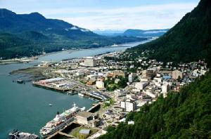
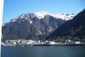
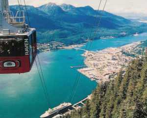
Juneau, Alaska
20121219-juneau-1-stay-560 juneau_alaska_thumb Juneau_Alaska juneautram panorama_winter
One of Juneau’s main features is Eaglecrest Ski Area, Alaskan Panhandle’s only resort. It is located on Douglas Island. Eaglecrest features 31 Alpine runs and three Nordic trail loops set on 640 groomed acres. Juneau is for the more adventurous of souls, boasting many ice covered lakes and glacial mountains in the winter. In the summer, it is an entirely different; peaceful atmosphere for a relaxed getaway.

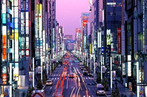
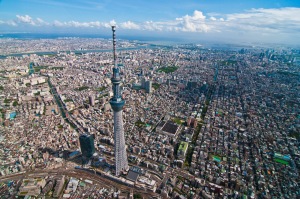
Tokyo, Japan
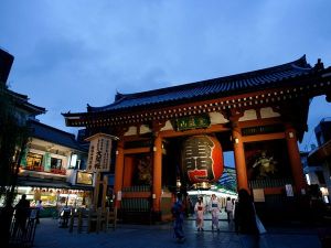
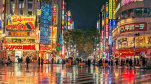
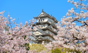
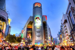
4285iB1A896000E15B3D5 guide-tokyo-bespoke-travel_12 nov-2010-free-tokyo_27209_600x450 places.tokyo seasonal-spring-tokyo-580 shibuya-tokyo-japan tokyo-main_247542k Tokyo-skytree
Tokyo, Japan is one of the worlds most densely populated metropolis’s and holds many, many ways to entertain yourself that is alien to the western world. From cat cafe’s to cosplay on Harajuku Street, there is always something new to look at. Speaking of the new, Tokyo also holds many traditional shrines and temples that are a must for tourists. Rife with festivals, shopping districts, host clubs, nightlife and traditional architecture, there is something for every kind of tourist.

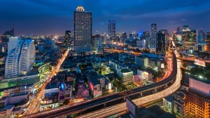
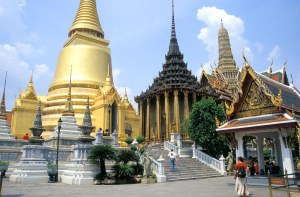
Bangkok, Thailand
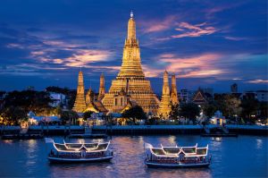
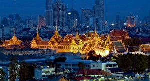
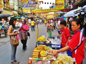
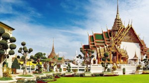
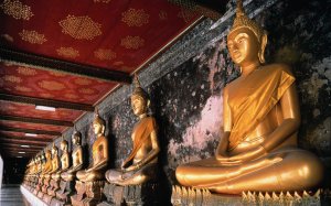
2769bangkok_city Bangkok3_thailand BKK Bangkok Wat Phra Kheo 1_2_b floating market in bangkok grand-palace-night-bangkok-thailand_main khao-san-road-bangkok-thailand maxresdefault row-of-golden-buddhas-bangkok-thailand_1680x1050_74042
Bangkok is full of exquisitely decorated Buddhist temples—as you go from one to the next you’ll be continually blown away by the craftsmanship involved in making these amazing places. Amongst the beautiful architecture is amazing Thai cuisine and street markets. —the restaurants and nightclub are meant to be some of the best on the planet.

Reykjavik Iceland
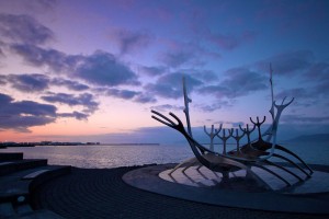
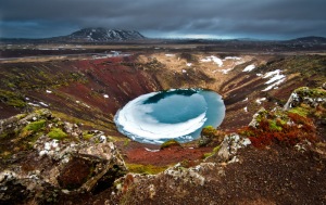
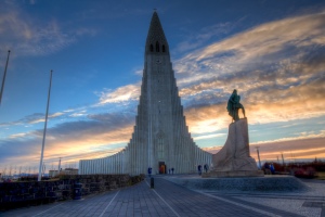
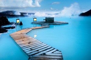
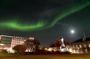
456420_2049_preview crater Hallgrimskirkja iceland-winter-tour-4-day-holiday-0 Northern-Lights-over-Reykjavik.-Image-by-Roman-Gerasymenko_5-660x440 PB065645 Reykjavík.original.2069
Reykjavik is the planet’s most northern capital. It is a popular spot for a relaxing getaway as it includes an endless array of spas and naturally heated geothermal springs. There is plenty of opportunity for adventurous outdoor pursuits including walking, treks and alpine hill climbing.

Kyoto, Japan
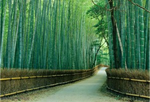
1066-1024x697_0 Kyoto-Japan Kyoto-Pic-06 Kyoto01 KyotoFushimiInariLarge Streets_of_Kyoto_Japan tulip-lined-staircase-in-kyoto-japan-21331
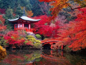
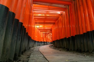
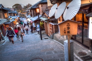
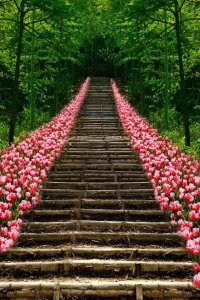
Kyoto is one of Japan’s most historical large cities, it is mainly known and visited for it’s natural beauty surrounding the cityscape, but most of all for the vast array of temples. There are many markets and hand crafted traditional Japanese trinkets to buy, museums to visit and stunning sights for the more relaxed visit.

Website Research PART 4

METHODS OF WEB DESIGN – 


When designing online content (particularly your own) you have to consider all of the different tools available to you and how they would benefit the type of content you are looking to create, as well as knowing some of the negatives of said tools. I am going to be looking at the following tools that are commonly used to design online content:
Wordpress
Adobe Muse
Adobe Dreamweaver
All of these programmes have similarities but at the same time, they have many differences.
Starting with WordPress, this is an online platform that allows you to either own a blog that can only be customised to a certain extent, it is governed by themes created by other people (you can make your own theme for a rather heftier price). The only thing that is overly customisable about these themes is the content you post, the colours, a few fonts and the like. The other side of WordPress is (in my experience) is the premium version that can be applied to pre-bought hosting and is much more customisable. You can use CSS and other online script languages to create a site from scratch, or you can opt to choose a theme made by someone else. These themes however are not like the themes on the free version of WordPress and are purchased externally from sites such as Themeforest. These themes are much more customisable, professional and, or course, rather expensive.
As I have mentioned above, there are themes available for WordPress making it rather easy to navigate, also once your site is done, it’s fairly simple to manage your content too. The main thing for me is that WordPress has a content management system, swell as supporting E-commerce, this is super useful for people like me who want to blog on my website.
One of the downsides of WordPress is that (assuming you, like most others, are using a theme) there is a limit on how customisable your site is and how unique to you it will look. Something I noticed also it that you have to be connected to the internet to make any changes to your site at all, this can be a downside to having a WordPress – based site if you are planning to make changes on the go. The best thing about buying WordPress themes is the support that comes with it, you will be able to put a ticket in to get help from the theme developer if needed. There are also many tutorials on sites such as YouTube that explain this.
I learned WordPress through self-teaching and the occasional helping hand from one of my old mentors from an apprenticeship I was on. I could further develop my understanding of WordPress via asking my tutors. I could also go online, though I don’t think there is anything substantial left to learn, it tends to just be small issues I may be having.

Adobe Muse is the second tool I am semi-familiar with. From what I can tell, Adobe Muse is like a replacement for Dreamweaver so to speak, by this I mean it is easier to use and navigate. All you need is to be able to design and boom! Your all set. Actually that is one of the downsides to Adobe Muse, you have to know how to use other applications such as Photoshop or InDesign to be able to effectively create what you are envisioning. Though muse is a cheaper and more effective way of creating content that doesn’t require a coder (to designers), people who do not have a design background will most likely find muse useless and will be more suited to a pre-made/bespoke theme from WordPress. I find muse brilliant because it is like a live version of Indesign… or so to speak. It has a lot of the perks of WordPress (minus the easiness) but at the same time is much more customisable. Something that really peeves me about Muse though is how there is little or no options when it comes to responsive designs because as I mentioned in previous research, the way a site looks on the go is important and can decide whether decides to come to you or go elsewhere.
When it comes to support using muse, there are options available, though Muse is still relatively new so there might not be quite as much content available as there is on the topic of WordPress for example. A website I highly recommend for learning Muse (or anything design orientated for that matter…) Is Lynda.com. This has all the resources you could possibly need for learning any software that might be beneficial to designing online content, the Muse ones have helped me a lot. To further my understanding of Muse I think I will stick to asking one of my tutors who is knowledgable on the subject, though I may also decide to use YouTube and other people’s blogs to help me learn.

Dreamweaver used to be the most popular web designing tool, though it’s popularity and usefulness has dropped dramatically after the release of Muse, WordPress and other easily customisable web content tools. This is why I don’t know much on the subject and after trying to use Dreamweaver, I got the feeling it was more for web developers and coders rather than designers like myself. Maybe I am incorrect but I feel like the downside to Dreamweaver at the moment is that designers no longer have to go through the tedious process of designing in photoshop then paying a coder to make it live for them. Instead they can produce their design in Photoshop, then do the rest in Muse themselves or to make it even more simple, they could use an existing theme from WordPress and customise it so no original content is actually required.

Thankyou for reading my research. Next shall be my ideas and development.
:3

Website Research PART 3

 SELF PROMOTION ONLINE –


There are many, many ways to promote yourself and your business. One way that hasn’t been around as long as TV adverts and billboards for example, is self promotion online.
There are many various platforms which you can promote yourself online. The main ones are: Social media, websites and ads.
First of all social media is one of the most popular and most effective ways of self promotion that you can use to your advantage because essentially, it might take you 10 seconds to write and post a tweet on Twitter that updates your readers and will attract new viewers. I shall be going through some of the common platforms below, using links from my own profiles on this site so you can get an idea of what people might post or make their profiles look like:

  • Instagram
    This is a photo sharing site based primarily for Apple users. The use of hashtags (#nomakeupselfie for example) is used as a marketing technique in itself, ways shops may do this is to get people who buy their products to post a photo on Instagram of themselves wearing the products, using their specific hashtag so others can join in and see it. People who have tonnes of Instagram followers make it easy to promote their site and what they do by frequently updating pictures relating to themselves/their business. They can also add their website/other media in their profile bios. The unique selling point of Instagram is that it is a trend, lots of people come together to share in the same place – this allows you to be part of a common crowd who has something different, allowing you to attract more followers. Instagram’s basic limitation is that every image has to be square and this could be a problem for those in the creative practice because they might not be able to display it in the shape/format they prefer. On the flip side of this, Instagram can be really useful for designers and the like for posting “in progress” shots or “teasers” of the work they are doing – using Instagram this way will make your followers curious to see the outcome – which they will have to visit your site to see, thus increasing your website traffic.
  • Twitter
    Tweeting on twitter is a super fast and easy way of sharing your thoughts or what your doing/where your going at a specific time, hashtags are also used here too. Some people may find this intruding and overkill, though it is a surprisingly effective way to keep your fans or client base in the loop at all times. You can even hook twitter up to automatically tweet whenever you post something on another social media platform, only making it even easier to use and update. This is what I do as I have no specific use form twitter until I finish my website and blog. The unique selling point of Twitter is how easy and simple it is to make your followers feel like they are a part of your business. For designers and those within the creative practices, Twitter is a great way to give your followers a break from your usual business/portfolio orientated content and give them a view into your personal opinions, jokes, whatever you post. Also, it is good for announcements and endorsing your other social media. One downside of Twitter for me is that it is highly word based. This may be a problem for those who rely on their visual portfolio to attract customers if they haven’t set up any other means of showing their work.
  • YouTube
    YouTube has become one of the most used and best recognised social media platforms out there, allowing people to promote what they do by uploading videos of whatever they want. I mainly use this to do tutorials for art though the possibilities are endless. Something like Google Adsense can be used to not only make money from ads on your videos, but make your own advertisements and broadcast them before other people’s videos for a wider client base to see. The unique selling point of YouTube is that there are no restrictions. You can advertise, give sneak peeks, show people behind the scenes…. whatever you want and there are millions of viewers with literally no limitations at all. The downside I’m pointing out on YouTube is prevalent throughout most if not all social media… though I’m linking it with YouTube because it is where I see it the most: Haters. The way YouTube works is so that there are no limitations to you… or the people who are free to comment hateful things on your videos. Though there are countermeasures in place to help moderate these kinds of comments, they could still harm the image of your business to those who take the hateful/insulting comments seriously. Despite all this, YouTube is a brilliant place for those in the creative practice because it allows you to create a documentary for example, of how you work, make a video portfolio and even make tutorials to teach aspiring designers/beginners how to excel in your practice by doing what you do.
  • Websites
    Personal sites can be anything you want them to be, aimed at whoever you want your target demographic to be. That is the beauty of websites, they can contain anything from blogs to portfolios, social media links to shops. Anything. This sort of flexibility allows you to get exactly what you want to get out of a website with the help of a designer (unless you are one). The unique selling point of websites is that they are 100% customisable and unique to what you want them to be. The only limitation I can think of when it comes to websites is that (assuming you don’t know how to design/build your own site), their may be the money issue of having to hire someone to do it for you, or the limitation of having to do it yourself when you don’t know how. All this revolves around your personal experience and the goals you have in mind for your site so it is more personal. Websites are the go-to way of promotion for creatives for many reasons, one of these that stands out is use of a personalised portfolio, for a lot of designers and those within the creative practice a portfolio is your ultimate selling point, it allows both existing clients and potential clients to see what you have to offer. The contact sections of websites are also very important as it tells people how to find and contact you for potential work.

Thankyou for reading! Continue to section 3 …

Website Research PART 2

ELEMENTS OF A WEBSITE – 

Screen Shot 2015-10-02 at 12.21.00Screen Shot 2015-10-01 at 20.02.32 Screen Shot 2015-10-02 at 12.21.07

  • I have chosen 3 websites that I think are really clever and different. I shallbe deconstructing a page from each of these websites so that I get an idea of different styles, layouts etc so that when I create my own website, I can have some inspiration of existing sites to work from. Below are links to my 3 selected websites:
    http://shibui.me/web/scroll/index.html#top
    http://www.numero10.ch/fr
    http://journey.lifeofpimovie.com/#!/buy
    These are all quite different sites from quite different countries, the reason being I would like to delve into as many site possibilities as I can within one research section. Let’s begin:
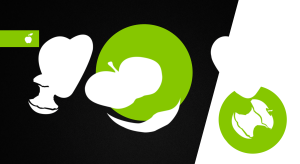
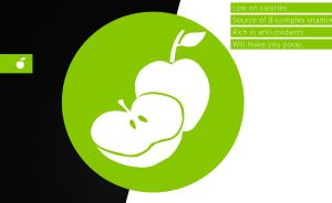
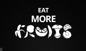
  • Shibui.me is a food health site. Upon first entering the site, we are immediately presented with a loading icon which, for most sites as elaborate as this one, is always present. The fact that the loading icon is there can be annoying to some, though I like how “be fruitful” is immediately immersing you in the topic of the site: Food. Paired with the spinning circle of simple fruit and veg icons, it’s keeping visitors interested while the cogs turn behind the scenes.
    When it comes to the layout of this site, there is no specific element that is set in place (other than the colourful sidebar that tastefully slides out once the beginning of a new ‘section’ has been reached). Because of the site’s scrolling nature, their is the option to either scroll and let the beautiful animations take form, or you can skip to different sections and simply view the finished illustration. The beauty of this site is that it’s layout allows it to be quickly viewed and the information read with ease from the top right corner (quietly complimenting the beautiful illustrations), or the full intended experience of the sight and it’s scrolling effects can be taken in. Overall it’s simple yet effective and aesthetically pleasing.
    Something that I really like about the site is the use of colours is cleaver. Mainly black and white is used for contrast and to exaggerate the movement of the panels and the singular colour that correlates with the type of fruit being represented. The bright tones scream modern and help to accentuate the small amount of information offered on the site – this is something a lot of sites use these days so these things never really seem too unique, though the way they have incorporated an interactive scroll really helps to separate it form the crowd.
    There is no traditional masthead on this page… the only similar thing that helps with navigation is the sidebar which is a unique twist on a typical ‘masthead’ while still delivering information/navigation effectively.
    The interesting thing that attracted me to this page so much is the fact that it seems to be set on only one page. In my opinion this is down to the different blocks of colour, fruit styles and moving black and white panels that splash colour into the visuals. The same goes for the footer as there doesn’t seem to be one.
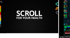
    Upon entering the site the first information we are confronted with is a title saying “Scroll for your health” in big, bold writing. This is a subtle way of telling us what the site is about without revealing too much in the process, the only worry I have about that is that it will fail to inform people enough, though I think in most ways the amazing graphics make up for that.
    Something I would change about this site is most likely the amount of information. I think a hovering button of some sort or a tab you could click on to gain more information would benefit the purpose of this site and prevent people from leaving the site so quickly after reading the minuscule amount of info presented to them.
    I wouldn’t realistically dream of incorporating such complex scroll animation into my personal website, though something I do like is the use of the sidebar as a kind of ‘section breaker’ allowing for much easier navigation. Below are some screenshots of the site incase your unable to access the link:
    Screen Shot 2015-10-01 at 20.02.32 Screen Shot 2015-10-01 at 20.02.46 Screen Shot 2015-10-01 at 20.02.52 Screen Shot 2015-10-01 at 20.03.06 Screen Shot 2015-10-01 at 20.03.44
  • The second site I have decided to look at is Numéro10.
    Numéro10 is a bilingual communications agency based in Berne, they specialise in synchronized communication.
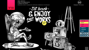
    As for the layout of the site, their header is what people immediately look for to find information. What I find interesting about Numéro10’s is that they don’t have the standard menu navigation, they simply have a small but very summarising section to the left describing who they are and what they do paired with a small but intriguing animation to the right hand side. This then leaves the question: how to I navigate the site? Well, the answer is simple – you use the sidebar menu that allows you to jump effectively to whichever of the sections within the site you would like to find. This sidebar navigation is brilliant in my opinion because not only does it stick with you all the way to the bottom of the site, but that fact allows you to jump from wherever to anywhere instantly without the hassle of scrolling. The footer is really good in my opinion because despite it being large, it fits in well by blending into the blackness of the illustration and delivers so much useful information in one go. I noticed that when I highlighted some of the french text within the footer, the highlight colour was pink instead of default blue – I think this is a cleaver and unexpected way to incorporate more of the sites branding and colour scheme into the site.
    One thing I thought would be a pain is that the site would look strange in tablet and mobile form…. but I have never been so wrong. Though the illustrations don’t move, all of the writing, sidebar, header, footer and information buttons become central and it still looks very unique and responsive.
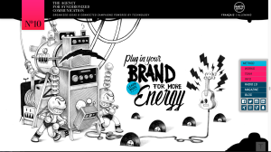
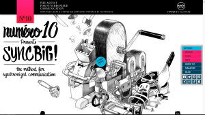
    The colours of the illustrations themselves are straight up black and white, this allows the bright blues and pinks of the more information orientated elements of the site to come through more easily and have a greater impact on the readers. An array of small buttons hover over each segment sporting their own bright colour to attract attention, I think the colour choice of the buttons could be a little better because towards the bottom two random colours (yellow and mint) that have no consistency within the site appear for the first time. I suppose this is a great way to attract more attention to these two buttons but then it belittles the other ones while not fitting into the sites colour scheme. The buttons are a great idea in my opinion because they offer a ‘fill in’ for any information people thing this site may be lacking in a creative and fully responsive fashion.
    The images are what really make up the both foundations and the finishing touches to this website – they are controversial and unique, not only that, they have the most amazing parallax scroll effects, making them come to life before your very eyes. This is another one page site that makes use of it’s beautiful parallax structure and illustrations to make it seem like each section you come across is a different page all together.
    The type without the information pop ups is limited, though for good reason. Unlike some websites who put little or no information at all, Numéro10 have put some very smart quotes that correlate with their beautiful artwork, a couple being the following: “Plug in your brand for more energy” (paired with a visual of a plug), also “Consumers from dinosaurs to butterflies” which reinforces how versatile they are. In my opinion, smart & witty sayings like these need not to be elaborated on as they portray what the business offers in a way as unique as the business itself. I like how their simplicity explains all and their messy yet somewhat appealing font screams ‘look at me’. This is an element I may use in my own website design. I wouldn’t change anything about this site – I love every design, visual and verbal element of this site and it’s some brilliant inspiration for my own site – in particular the parallax scrolling is something I would love to look into.
    The screenshots below don’t show the beautiful parallax structure of this website, though they do show the use of colour, layout and the quality of the illustrations. If you can, check out the link at the top of this post:
    Screen Shot 2015-10-02 at 12.51.29 Screen Shot 2015-10-02 at 12.51.41 Screen Shot 2015-10-02 at 12.51.53 Screen Shot 2015-10-02 at 12.52.01
  • The third and final site I am looking at is actually a promotional website behind a rather popular movie, Life of Pi. Life of Pi was complimented by many for it’s stunning visuals and enthralling storyline so I expected the site to be beautiful, though I couldn’t have imagined just quite how stunning it actually is.
    The layout of this site follows a rather ‘random’ (not in the sloppy sense) structure that reminds me a little bit of cubism with it’s sliding panels and overlapping images. The thing I like the most about the design is how user-controlled it is, while the site scrolls at the pace of the user it doesn’t necessarily scroll ‘down’… it goes across, up, down, you name it. This creates a sense of motion and control when paired with the selectable sections. There is no header on this one page site and there is really no need at all for one in my opinion, same goes for the footer – although there is one, it is tiny and serves only the purpose of informing people about Facebook, twitter, legal links and that there is in fact a Life of Pi DVD. It’s visuals are insignificant in comparison to the rest of the site, though it fulfils its purpose without imposing on the overall design so far. I can’t comment on the colour because this site doesn’t have much of a colour scheme due to all of the different cinematic images and videos – something I do approve of though is the white type and simple squares used, the reason for this is because they are simple yet tasteful and help to bring out the bright coloured images.
    The text is tasteful and cleaver because though there isn’t much written, it gives you as much as you need to know alongside the images which tend to do the most explaining.
    My favourite interactive element of this site is 100% two of the scenes from the movie used full screen. It is not just that these captures are beautiful and represent how beautiful the design is with pride, it’s that they are interactive, meaning every time you scroll slightly with your mouse, the stills start to play like a video. I have too a screenshot of these sections below, though I recommend visiting the site and scrolling to see the full beauty of these:

    I intend to use something such as this in my website as I find the fullscreen, interactive element to break up each segment and add beauty at the same time.
    There isn’t much of a navigation system other than scrolling which brings you to the ‘section breakers’ where your either fed information about the visuals at hand, or your introduced to a different part altogether. I think the site is very effective at fulfilling its purpose of selling the dvd. There isn’t really any need to do anything other than show how utterly beautiful the movie is which is done very well using layout and a flowing, interactive layout. I don’t think I’d change much about this site – the only thing would be to maybe add some sort of small button where a popup menu of sidebar can be used to skip to different segments of the website.
    When it comes to inspiration for my own website, the main things that intrigue me are the scroll-triggered animation snippets from the movie, also the simplicity of the text.

Thankyou for reading this post! I hope you found these sites as beautiful and interesting as I did! 🙂

Website Research PART 1

After my introduction I have decided to begin researching other websites as a starting point for this new project, starting with the following:

HOW WE ENGAGE WITH THE WEB


  • There are many different uses for websites depending on the target audience and what the shop is intended to achieve. Some of the different types of websites I have come across in everyday life are shops (e commerce), blogs, social media, portfolio sites and information sites. Shops are websites made with the intent to sell items (or programmes, backgrounds etc) to the public to make a profit and essentially promote their own merchandise. Some of my favourite examples of shopping websites are as follows:
    http://www.apple.com/
    http://www.regalrose.co.uk/
    http://www.topshop.com/
    Blogs are basically a self documentation site, much like the one you are on now, where a person can document something and publish it in a way they like. Blogs have become increasingly popular over the past few years as social media has also taken a swift rise on the net and has now become one of the best advertising methods for companies. An example of what some people might blog is fashion and beauty, travel, art and many other things. Below are some popular blog sites:
    https://www.zoella.co.uk/
    https://www.nomadicmatt.com/travel-blog/
    https://www.bloglovin.com/ (This is a bit different as it is a platform to contain many blogs)
    Social media websites (as most people will know and use daily) are sites (much like blogs) that allow people to post personal content onto the web and connect with their friends and family, or even gain followers and create an audience. Social media has become a platform on it’s own over the past decade, giving birth to new online celebrities and allowing people to always keep track of people they are close to (or not so close to) with ease. Below are some social media sites:
    https://instagram.com/
    https://twitter.com/
    https://facebook.com/
    Portfolio sites are sites which people use to promote or display their work to a client base or the public/online community. Companies mainly use this type of site to show potential or returning clients what they could produce for them, personal portfolio sites are mainly used to showcase what someone does for a hobby:
    http://ryanscherf.net/
    http://smartgc.com.ar/english.php
    http://www.adhemas.com/
    Informative sites are mainly things that deliver information and news to people online. These are commonly used by students to gather research when libraries seem too overbearing, also in everyday life by people who want to know facts or see what is going on in the world. Examples below:
    https://en.wikipedia.org/wiki/Main_Page
    http://www.bbc.co.uk/

  • The benefits of having a website… well their is one main goal in my head and that is exposure. The more people see your website, the better in my opinion. It is a way of spreading your passion/what you do beyond common advertising techniques and word of mouth.
    For sites like shops, the benefits could include reaching a wider client base, for example people who can’t reach their stores can simply buy online. When it comes to huge companies, using smaller yet popular sited to place their advertisements on is also a given benefit alongside being able to easily convey information on their own site.
  • SEO is an acronym meaning Search Engine Optimisation. What SEO does is optimises your site using various methods when people use search engines such as Google. This basically determines how popular/important your website url is amongst all the other sites on the web. All in all it’s the process of maximising the number of visitors to a particular website by ensuring that the site appears high on the list of results returned by a search engine.
  • What makes an effective/ineffective website is not defined by one ideal alone, it depends on various aspects, one of which is the intent of the website in question. What will work for one website might not work for another. An example of this is if a news agent website and a teenagers clothing website used each others styles. If the teen clothing brand made their site corporate and plain, whereas the news agents site used a hipster, young theme then they would not work because a corporate appearance wouldn’t appeal to young adults, similar to the fact that if a business man went to a news site and was confronted with a young theme, they wouldn’t take the site seriously and would probably would flee to the BBC site for what seems like more reliable information.
    To put a more generalised list together is hard because of the many different sites out there with their many different purposes. Below is a list of some things I think helps a site be successful/effective:
    Appropriate for the subject at hand
    Puts information across clearly
    Easy to navigate (3 click rule)
    Mobile appropriate
    Loading times
    Images/Visual representations
    Unique yet easy to understand
    These are only a few things that make up a good website. All of these things work in conjunction with each other and something I have noticed is that there needs to be a balance between these points, if one area is brilliant yet another important area such as navigation is lacking, this can also make the site seem overall bad despite it only being one thing that is lacking.
    The things that make a bad website are basically the reverse of my above list. Simple things such as a disregard for audience, using a complicated & difficult to navigate sight structure and so on.
  • When people asked how we access the web about 5 years ago, people would have instantly said something along the lines of “on the computer”. Nowadays however, things have changed a little. People are accessing the internet through mobile and tablet devices more than ever, through online games, mobile apps, iTunes and music apps. There are so many different apps, browsers and devices that can access the internet that you need to be prepared for any (if not all) of these modern devices to access your website via any of these methods.
    An example of a site not being prepared for modern ways of accessing the internet is as follows: A designer makes a site for a clothing company. This website functions properly on desktops, fulfils it’s marketing purposes and looks rather nice in the process. The only problem is that the design isn’t responsive, meaning when someone tries to access this website using an iPhone 5 for example, the design will not alter to the size of the phone, requiring a lot of zooming and messing around to navigate the site.
    The above situation is more important than it sounds because it could define whether or not someone wants to visit the site or go elsewhere. If your website only works fluently on one device (a desktop for example) but not on others, it will become a hassle for clients or visitors to get to where the need and thus will affect who views your site.
    On the other hand, a good thing to do when designing your site is consider ALL platforms, apps etc. This way you are covered no matter who tries to view your website, making sure your not inadvertently turning people away due to the responsiveness of your site.
  • There are many strengths and limitations of modern web devices. As mentioned above, you should structure your site to be responsive to as many different web devices as possible. The strengths of devices such as mobile phones and tablets, iWatches and Google Glass is that they can be transported, allowing easy access to the web (and your website) from virtually anywhere. Not only does this allow more people to tune in any time of the day, but it could improve sales for e-commerce sites because people may be able to buy anywhere and everywhere without limitations.
    A weakness of modern mobile devices that I feel a lot of ‘unique’ sites that use a lot of plugins will face is that the devices simply don’t run the site properly. Either this or that the resizing/alteration of certain aspects that use unavailable software to run becomes an issue.

    I hope you enjoyed part 1 of my research, see my next post for part 2.

Introduction

Welcome back to my blog as the new degree year begins and with it, an new project.
We have been challenged to design our own website and brand. The basic criteria of this is rather open as it is something personal to us. Some of the things I am planning to include in my website design is a personal logo, portfolio for design, art, photography and maybe writing, an about/contact page, my degree blog (which your reading now), my personal blog, a homepage and more general concepts personal to me and my own style.
The only issue I’m having so far is the latter… finding my style. Being 18, I don’t feel like I have 100% developed my own style yet, though I may be around 80% there. Some of the things I like and am interested in are listed as follows:
Fog
Eerie
Rock/Metal music
Wispy stuff
Peaches
Pastel
Korea
Cameras
Black
Forests
Bones
Manga
Hiragana
Ink
Moths
Hair
Wolf
Water
Flowers
Branches
Hands
White
Smoke
Pale
Fox
Curly hair
Gnar
Blonde
Angels
Cat
Deer
Eyes
Lashes
Feather
Tears
Blood
Drained colour
Black and white
Anime
Tokyo
Proactive
League of Legends (ehehehehe)
Gaming
Art
Drawing
Lamb
Dew
Moon
Night sky
Candy floss
Pink

(^ According to my friends ha)

This is only a part of a list that could go on forever. I am currently brainstorming with me and my family, things that they ‘associate’ with me and my style. I think getting other people’s opinions on this is the best idea so I’m not completely coming up with everything myself. One of the people in particular is my sister, Tatiana… she is present in many of my photographs and knows better than anyone what my style encompasses so she was the first one I went to other than myself.

After my little brainstorm to give me an initial starting point for what I’m about/what people associate me with, I decided to start my research. This shall be continued in the following posts within the category ‘Personal Website Design

I hope you are as excited for this new project as I am! Keep checking out www.gemoomay.wordpress.com for updates! ^^
Thankyou for reading.

The Academy of Fine Arts, Munich – A Presentation.

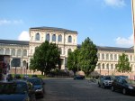
To start off this presentation I shall begin telling you about the main focus of this topic; ” The Academy of Fine Arts” in Munich, Germany.

München_Akademie_der_Bildenden_Künstehttp://en.wikipedia.org/wiki/Academy_of_Fine_Arts,_Munich

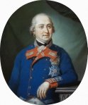
The Academy was founded by a man named Maximilian I Joseph of Bavaria in 1808 and was originally named “Royal Academy of Fine Arts” by Duke Maximilian himself. Before this it was a drawing school founded in 1770 which was destroyed in the war, however in 1946: the arts-and-crafts school was again incorporated into the Academy’s choice of running courses. The Academy’s original intent was to be a hierarchy for all art schools in which painting, graphics, sculpture and architecture have been the main focus of the Academy’s curriculum.

Portrait-of-Maximilian-IV-Joseph-Elector-of-Bavaria
(Maximilian I Joseph of Bavaria)
http://www.arthermitage.org/Conrad-Geiger/Portrait-of-Maximilian-IV-Joseph-Elector-of-Bavaria.html

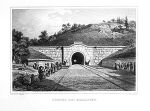
In 1886 The Academy of Fine Arts moved into its new premises, built by Gottfried von (of) Neureuther who engineered the Ludwig South-North Railway and was an early student of the school himself. In more recent years an extension on the building was finished in 2005 by Coop Himmelbau.

neureuther_internetnnnnn300px-Burgbergtunnel_Erlangen_001
(drawing of Gottfried von Neureuther, The Academy of Fine Arts, Ludwig South-North Railway)
http://www.bib.veitshoechheim.de/index.php/wir-ueber-uns-55
http://www.stadtbild-deutschland.org/forum/index.php?page=Thread&threadID=2436&pageNo=3
http://en.wikipedia.org/wiki/List_of_works_in_the_Museum_of_Modern_Art

The architecture within Munich around the 1800’s (the time Gottfried built the academy) was very much stone based with cast bronze features and statues.

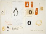
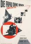
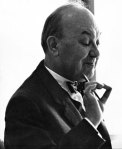
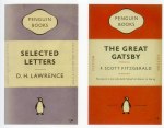
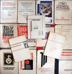
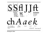
Many an artist, sculptor and architect has come and gone from the Academy’s walls alongside many styles and influences. Some of the well known artists who passed through the Academy are: Otto Mueller, Kandinsky, Paul Klee, Franz Marc, Lovis Corinth and my personal favourite, Jan Tschichold. Tschichold was a typographer, book designer, teacher and writer who is claimed to be one of the most powerful influences on 20th century typography, though there are few who would attempt to deny this statement. He worked on the design of Penguin books and some of the fonts he designed are Transit (1931), Zeus (1931) and Saskia (1932). See some of his work below:

Jan Tschichold copy jannan janTschichold-The-Wo-002 janTschichold JT6013
(Jan’s work, his designs for Penguin Books, and a portrait of Jan himself second to the right)
http://ia.net/blog/learning-to-see/
http://www.theguardian.com/culture/gallery/2008/dec/05/design
http://shanny12.wordpress.com/jan-tschichold/
http://retinart.net/graphic-design/jan-tschicholds-inspiring-penguins/

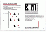
Jan created a set of typographic principles which he published under the title “Elementaire Typographie”. In 1928, Tschichold published Die Neue Typographie, a full directory of his new ideas for typographic design. It is the first manual of typography for designers.

immagine18 544_coverbig
(Jan’s “Elementaire Typographie” pages)
http://wiedler.ch/felix/books/story/544
http://imgarcade.com/1/jan-tschichold-elementare-typographie/

Jan was the son of a signwriter, his first career was as a calligrapher for advertisements, he was exposed to typography and trained in calligraphy since he was young, however his connection with The Academy of Fine Arts is significant. Jan  was bourn in Leipzig, Germany (one of the main book-printing/print cities) before entering Munich for his studies.
Long after Jan graduated from Munich school Hitler was elected and The Nazis disliked Tschichold’s asymmetrical designs, he and his wife were then arrested before fleeing to Switzerland where they lived until his death in 1974.

sabon
(Jan Tschichold’s font, Sabon.)
http://spenceralley.blogspot.co.uk/2010/04/sabon.html

Currently the Principal of The Academy of Fine Arts Prof. Dieter Rehm, the ‘deputy heads’ or ‘vice-presidents being Prof.Urs Greutmann, Frank Hilger, Prof. Karin Kneffel and  Prof. Hermann Pitz. There is and always has been a large number of both foreign and German applications every year, even since it’s founding in the 1800’s. 700 students are currently taught by 36 professors. 60 lecturers complete the programme with special courses and the high proportion of international students proves the academy’s amazing international reputation. One of the Academy’s most famous international graduates was named Giorgio de Chirico.

akademie-der-bildenden-kuenste-muenchen-341
(Ariel view of The Academy of Fine Arts, Munich)
http://www.m-luftbild.de/luftbild/akademie-der-bildenden-kuenste-muenchen-341.html

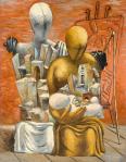
Giorgio de Chirico was an Italian artist who studied at Athens School of Fine Arts then the Academy of Fine Arts in Munich. He founded the scuola metafisica art movement, which later influenced the surrealists. Giorgio then began working in neoclassical and  neo-Baroque style, while still sticking to his metaphysical style of before.

The Painter's Family 1926 by Giorgio de Chirico 1888-1978 Giorgio_de_Chirico_(portrait)

http://en.wikipedia.org/wiki/Giorgio_de_Chirico

http://en.wikipedia.org/wiki/List_of_works_in_the_Museum_of_Modern_Art

Another international student of The Academy of Fine Arts, Munich was Paul Klee, he was born in Münchenbuchsee, Switzerland, in 1879. His work mainly consisted of cubism, expressionism and surrealism.
This just shows the wide variety of styles that passed through The Academy of Fine Arts in Munich with students studying a range of different courses as you can see below:

Free Art

Sculpture, stage design and costume, photography, glass, goldsmithing, graphics, ceramics, painting, media artArt Education (First State Exam)

Sculpture, graphics, painting, mediaInterior Design (BA)

Figures in space, product design, interior design

Advanced degrees
Architecture and Arts (MA) Visual Arts and therapy Interior Architecture (MA)
Studiengang- and class cross-listing
Theory Chairs

Art history, art education, philosophy (Aesthetic Theory)cx centrum for interdisciplinary studiesProject classes

Digital and time-based media, visiting professorsStudy workshops

Erzguss, photography, plaster casting and stucco, glass processing, glass painting and mosaic, goldsmithing, wood, ceramic, plastic, lithography, Illustration Technique, metal, new media, media education, paper and recycling, etching, screen printing, stone sculpture, typography and high pressure

The official website for The Academy of Fine Arts, Munich is: http://www.adbk.de/

That concludes my presentation, thank-you for listening.

Intro to Design Breif

Hello there ^^
So today we got the brief for our first Graphic Design Degree project, it is worth 10 credits, titled “Introduction to Design”.

Basically what we have to do for this brief is create a structure of any form as long as it has meaning, then choose a location which we shall photograph. The final stage is to super impose this hand-crafted sculpture (structure) into the background/location of our choosing, we have to explain our thought process and why whatever we are doing at that time has meaning.

I shall begin research to start me off in the next post:)

Research Into Structures

We have been briefed for our first project by Mark.

Our assignment for module 1 is to create a structure that we will later edit into a location of our choosing. This structure has to have form and meaning, but can be anything we like as long as it fits the guidelines.

To begin this module I’ve started researching different sculptures and structures, mainly public art as I want my structure to be public. I decided to do this step first because it really gives me grounding and inspiration to begin brainstorming my own independent ideas. Below are three pictures I’ve selected personally, I have chosen them because they are to my taste and style.

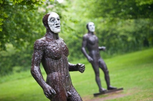
Riace Figures by Elisabeth Fink @ Yorkshire Sculpture Park

I have actually seen the above sculptures in person, they are located in a grassy field in Yorkshire Sculpture Park. The reason I like these little structures is because they create a sort of eerie atmosphere to anyone passing through their gaze. The all – bronze colour contrasts beautifully with their pale face, again creating the effect that they’re watching you.

b7_1pro___ivy_wire_sculpture___video_tutorial_by_davidbrinnen-d5x1k46

What drew me to this second structure is the way there are many different components (ivy wire in this case) can come together in such harmony to create a beautiful, flawless form. I think the real object this is based off is open to interpretation, as well as the meaning. The way people are left guessing is what really drew me to this little (presuming it’s little) sculpture.

article-2218664-158AFD55000005DC-392_306x510

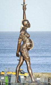
Finally moving onto Damien Hirst’s bronze occupant of Ilfracombe Harbour. Though this is considered strange because of the exposure of the inside of this woman’s body, I find it intriguing and beautiful. I found this sculpture after a conversation with my Father after him mentioning this “extremely strange woman in Ilfracombe Harbour”. Bronze is possibly my favourite sculpture material.

I have looked at many more public structures and art and I think I’m ready to start brainstorming my own ideas.

Further Research and Development….

The next step was my research.
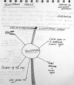
I decided to begin with brainstorms and sketches…. many of them. Finally I reached a conclusion of 3 sculpture Ideas that I was fond of. See the sketches below.

IMG_9224

First step for me was to create a few initial ideas that I later elaborated on…

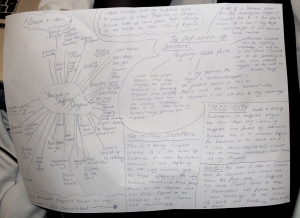
IMG_9218

Here I brainstormed many ideas and came up with the final 3 ideas I liked. I also did some research into the definition of structure, some links which I read into can be found below also:
http://en.wikipedia.org/wiki/Structure
http://dictionary.cambridge.org/dictionary/british/structure
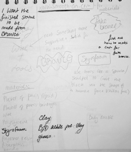
IMG_9223

Because I knew my three Ideas could be constructed from similar materials I then began to look into the materials I could use, I took inspiration from some of the structures I had seen. Find the links below.
http://www.angelofthenorth.org.uk/
http://corben-dallas.blogspot.co.uk/2012/10/damien-hirsts-verity-statue-ilfracombe.html